AHEAD OF ITS TIME
The IBM Building’s unique design is a clever way to keep birds off, cool the building and reflect its namesake’s legacy
It’s true,” says David Striph, senior VP for the Howard Hughes Corp. and the man occupying a corner office with two walls of windows framed by the iconic concrete arches of Honolulu’s IBM Building. “I sit here every day and birds really don’t perch there, or nest there.”
And they don’t poop there. To prove the point, we both took a good look around and, sure enough, no evidence of fowl play.
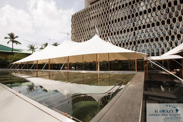
Hawaii’s renowned architect Vladimir Ossipoff wasn’t just thinking about birds when he designed the building in 1962 with a casted concrete flourish. His inspiration was both practical and historical: keep the birds away, create a sun screen to keep the building cool and design it to look like the computer punched cards then synonymous with IBM and computing history.
An architectural feature formally known as brise soleil, the casted concrete design deflects sunlight, while retaining the ocean and mountain views. Does it keep the building cool? “That’s true, too,” says David Akinaka of Ferraro Choi, a building tenant and the architect selected to restore the building. Ossipoff is celebrated for being ahead of his time, focusing on the connection between architecture and landscape, and, according to Akinaka, they have lowered A/C usage to prove it.
When Howard Hughes acquired the building, it was almost as old as those punched cards, and headed for a similar fate. “The previous owners had planned to take it down,” Striph says, “but we got here and found many in the community committed to saving it, so we started reimagining what it might be.”
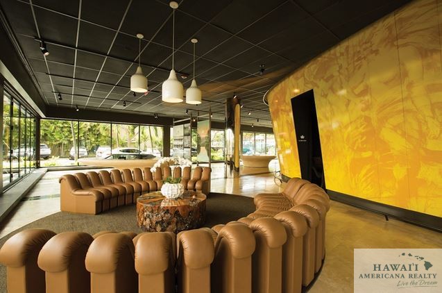
To illustrate how the building had lost its luster, Akinaka and Striph both talked about the faded pink carpet on the walls of each floor’s elevator lobby, an interior design style once hip, but now decidedly dated and shabby. While much of the $25 million restoration includes back-of-house infrastructure, wood and stone surfaces to replace the pink carpet, and modernized finishes, it’s the first floor common areas that keep people buzzing.
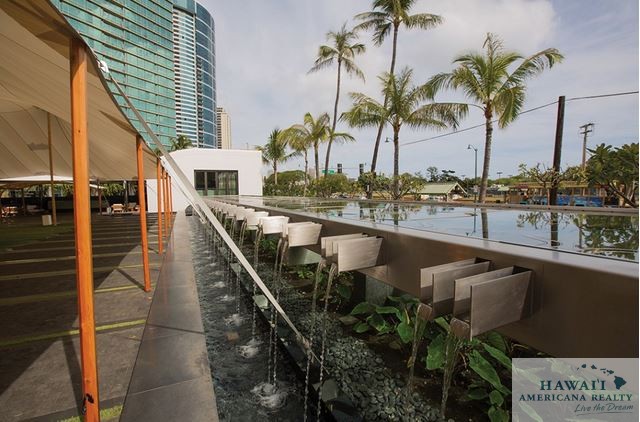
“We turned a parking lot into a venue,” Striph says, pointing out that the seemingly random paving stones and grass design of the courtyard are actually a mirrored image of the iconic brise soliel and the lanai doors – flush with the courtyard – slide open to create an enchanting gathering place.
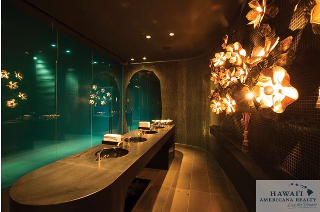
Regulars to the building always encourage first timers to check out the restroom. A playful design that includes a shared washstand area and frosted glass walls separating the men’s and women’s toilets, Akinaka describes it as a space designed to break down barriers and create a provocative gathering place. “But no Tinder matchups there yet,” he adds, “at least that we know of.”
IBM remains a tenant of the historic building, occupying much of the fourth floor, and its name remains on the building’s exterior. “Replacing the IBM with the Howard Hughes logo came up in the design phase,” Akinaka says. “But the Howard Hughes folks were adamant: ‘No no no. It’s the IBM Building.’ ” And so it remains, outlasting the punched cards and still keeping the birds away.


